Redesigning a coliving in Tenerife, from the inside.

Six months at Nine Coliving through Erasmus+, as community host and designer: brand identity, website and internal operations.

Role
Community host & designer
Programme
Erasmus+ Young Entrepreneurs
Duration
6 months on site, Mar to Aug 2024
Team
5 people
Deliverables
Brand identity, website, Notion ops system
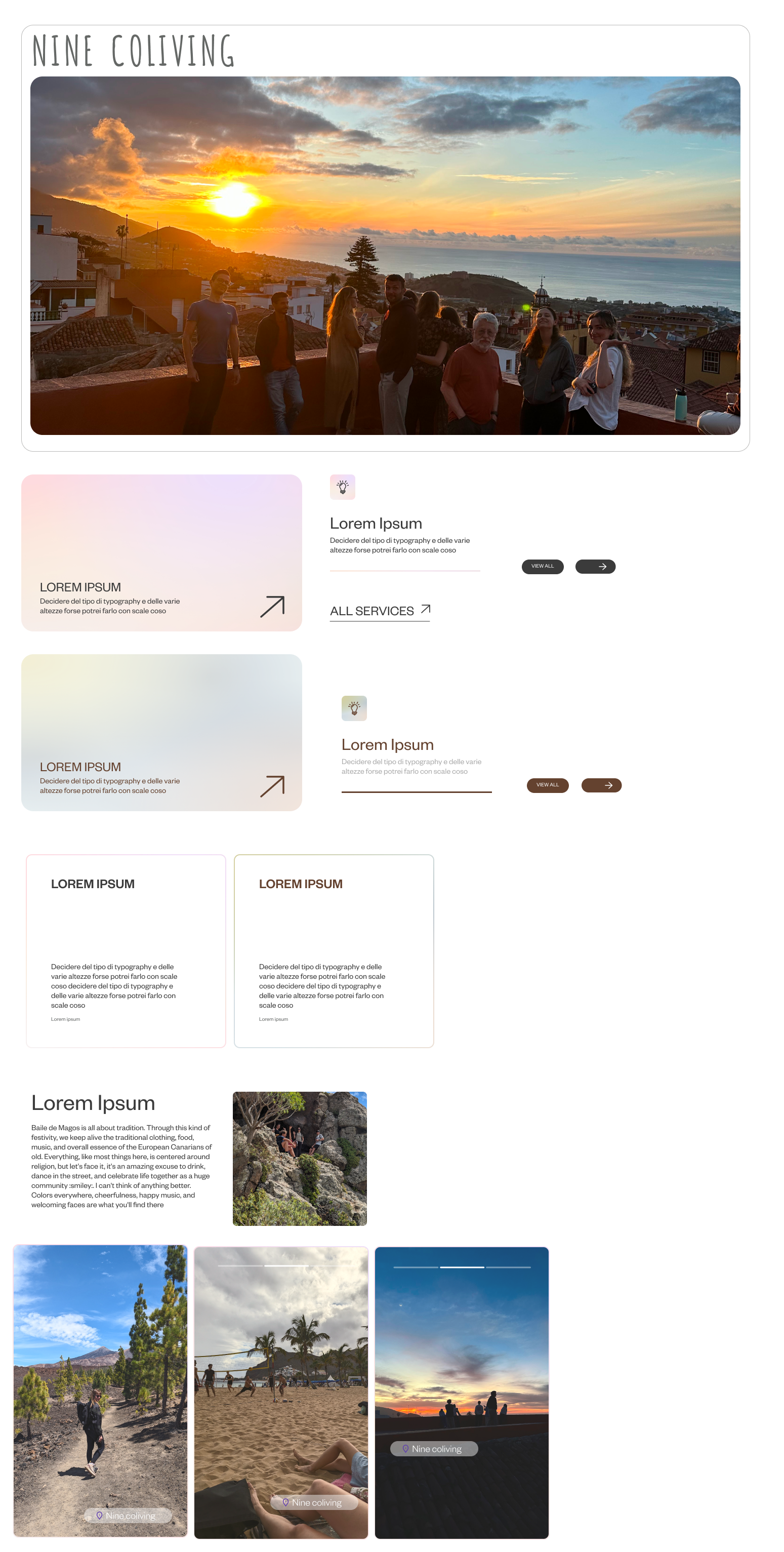
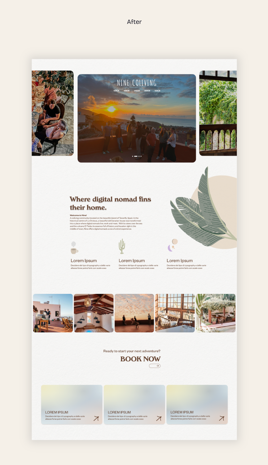
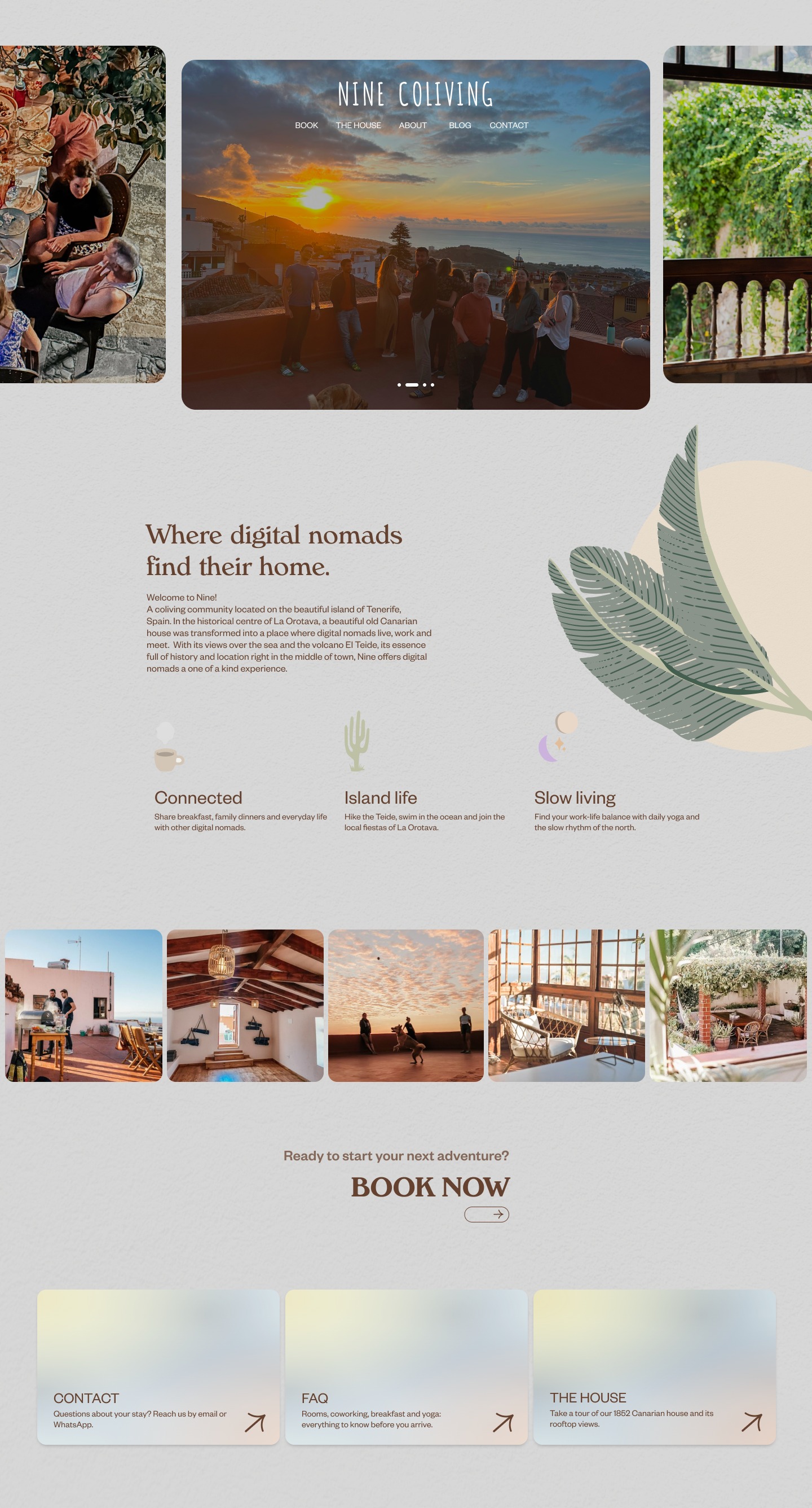
Redesigned Nine Coliving homepage hero

The redesigned Nine Coliving homepage.

01 / Context

Nine Coliving is a small, community-driven coliving space in the north of Tenerife, hosting remote workers and creatives for stays of a few weeks to several months. As community host I ran check-ins, supported guests and held the daily life of the house. As designer I used that same proximity to rebuild three things the team had outgrown.

01 / Audience mismatch

The visual identity looked dated and narrowed the audience: people read the brand as aimed at women, while Nine was built for a mixed community of remote workers and creatives.

02 / Invisible daily life

From the outside, it wasn't clear what activities happened at Nine, who stayed there or what a normal week looked like. Prospective guests had to guess.

03 / Fragmented operations

Internal workflows were spread across tools that didn't connect. This slowed down host onboarding and made it easy to lose guest information.

The brief: make Nine legible to guests, to the team, and to the island it sits in.

02 / Research

What the research showed.

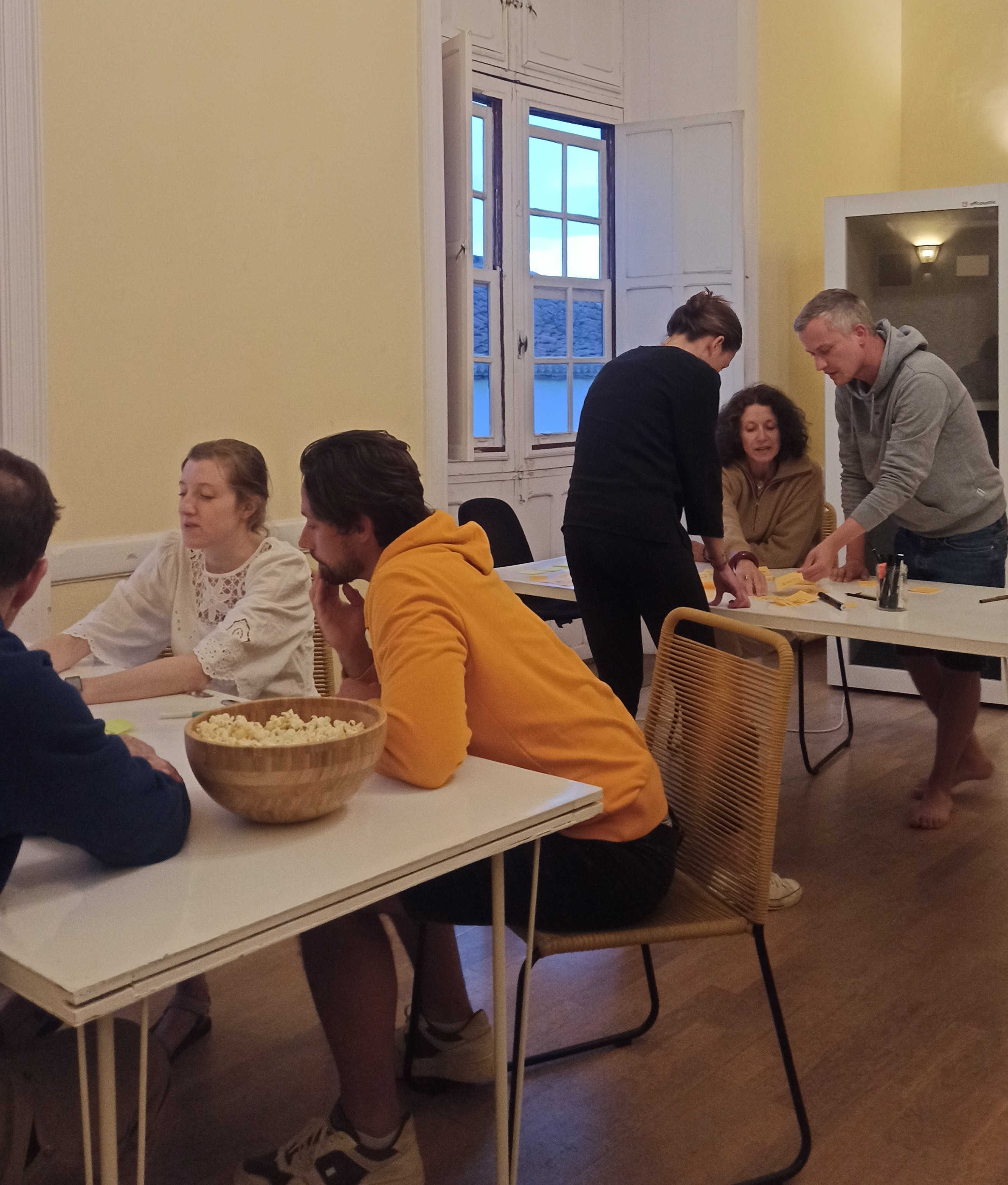
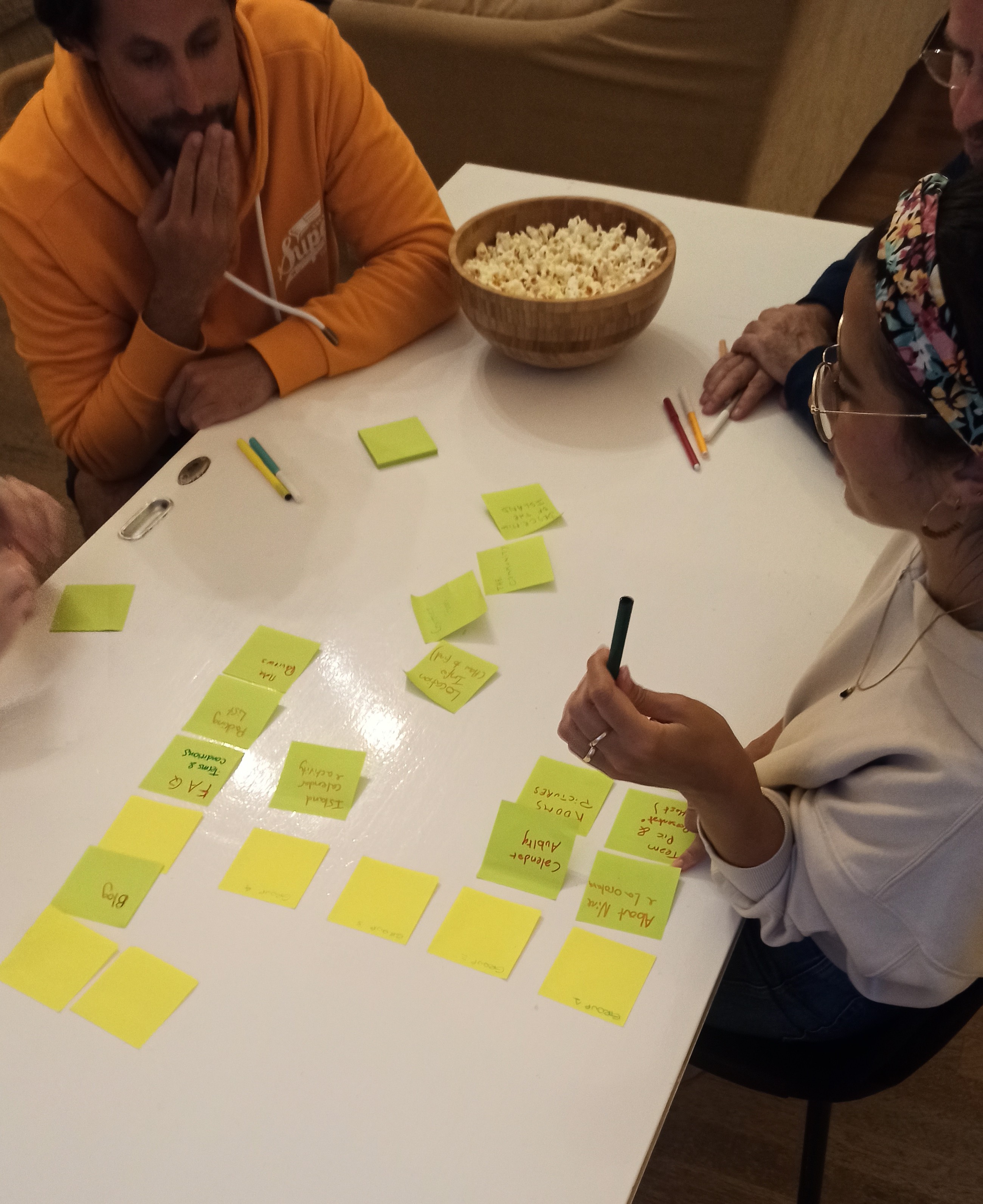
Living and working at Nine for six months meant the research never really started or stopped. Check-ins doubled as first interviews, shared dinners surfaced patterns a survey would have missed, and the team's daily rhythms became the baseline I designed against. In total: 32 checkout interviews, a community-wide survey with over 100 responses, a card sorting session and four focus groups with guests and team members.

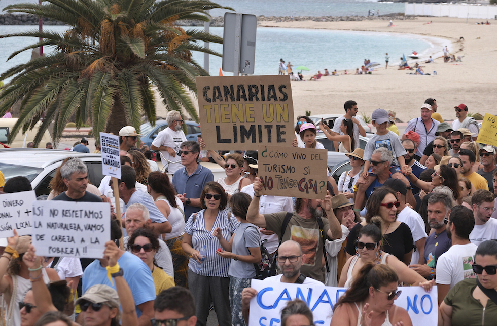
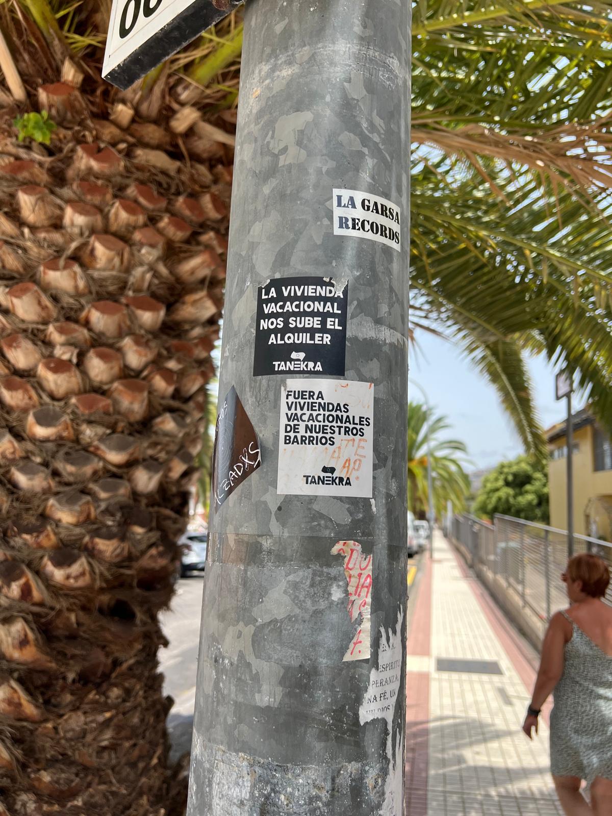
The research went beyond the website. Tenerife was openly questioning the cost of mass tourism, and Nine wanted to be part of the answer. We ran workshops for the community on Canarian traditions, and created a guest guide to local shops, restaurants and beaches, so guests could spend their time on the island in a more ethical way.

32

Checkout interviews

100+

Survey responses

1

Card sorting session

4

Focus groups

Protest in Tenerife with signs reading Canarias tiene un límite
Manifestation, Tenerife, 2024
Street pole with anti-tourism stickers in La Orotava
La Orotava, street level
Card sorting session with team members
Card sorting session
Focus group on guest experience

01

The brand was attracting an audience the team hadn't chosen.

70% of bookings came from women aged 28 to 35, but checkout interviews showed that the target audience was mixed: remote workers, creatives and freelancers of all genders and ages. The visual identity was narrowing the audience before the team could reach it.

Design decision

Rebuild the brand identity with a tone that is inclusive but still has character: new colour system, typography and editorial voice.

02

Guests came for the coworking and came back for the community.

Most guests booked Nine to work remotely from a beautiful place. In interviews, every returning guest gave the same reason for coming back: the people and the sense of belonging at Nine. The website was promoting the coworking more than the community.

Design decision

Restructure the website to lead with the community, using niners' portraits, shared experiences and daily life, with the workspace as a secondary topic.

03

Guests who understood the local context wanted to take part in it.

Through workshops on local history, conversations about tourism tensions in Tenerife and focus groups, we saw a consistent pattern: guests who were given context changed how they behaved. They chose ethical options over convenient ones, joined local traditions, supported local initiatives and volunteered.

Design decision

Build 'About Tenerife' as an editorial section with Be Conscious, a festivities calendar, hikes and culture, so the island becomes part of the guest experience.

04

Information sent too early gets lost.

Guests received all the information at booking, sometimes a year in advance. By the time they arrived, the email was buried and the information was out of date. The system was correct, but it didn't work in practice.

Design decision

Spread information across the stay: a reminder email one week before check-in, an automated Slack welcome on arrival and printed infographics in each room.

03 / Design

Redesigning what was already there.

Nine already had a Squarespace site, a tiffany-blue logo and an audience built over several years. The goal was to keep what was there and build a visual system around it that matched the experience of staying in the house.

03.1

Visual concept

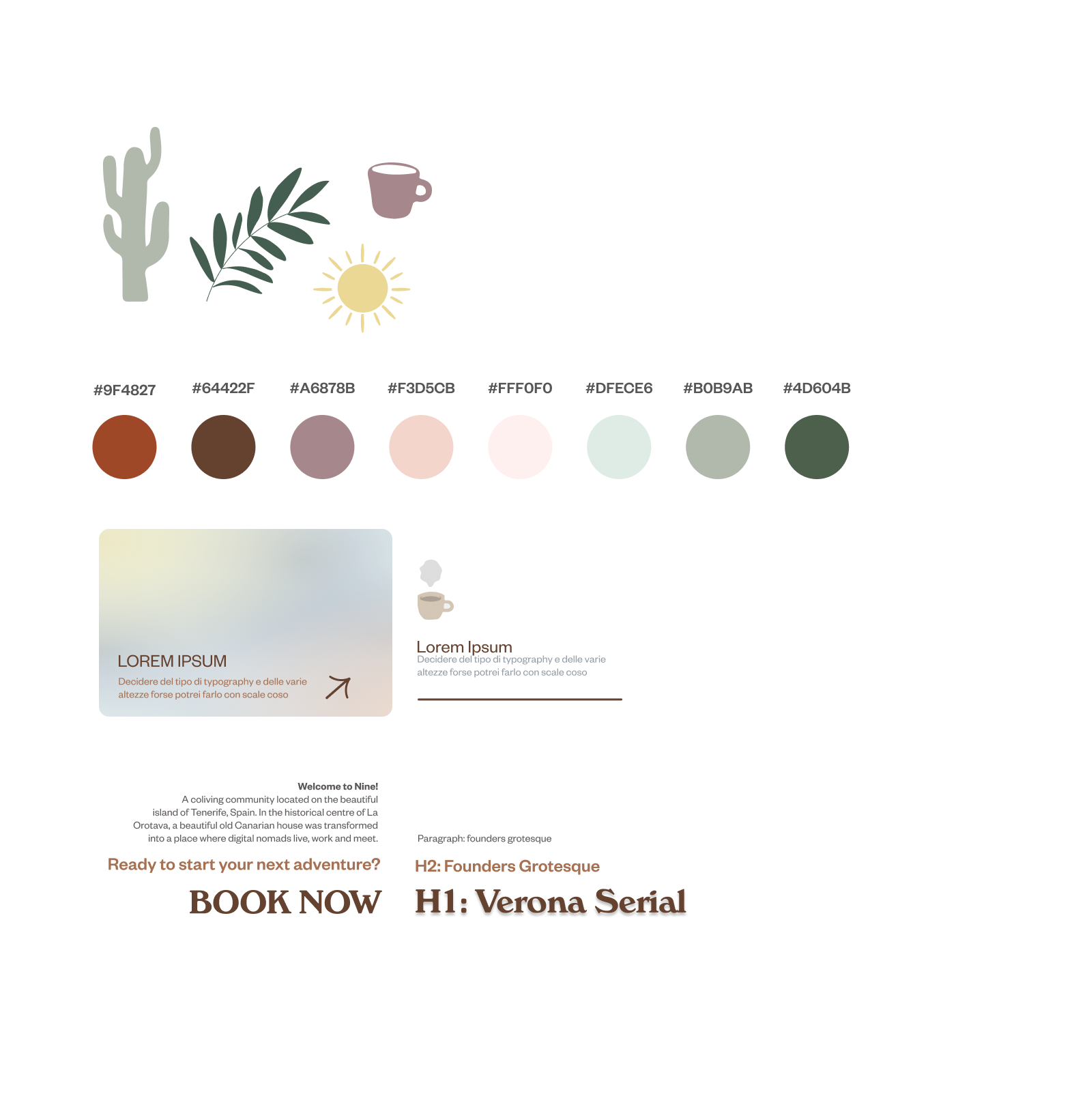
Nine had no colour palette, only the tiffany blue of the logo. I kept that blue for continuity and built a palette around it, based on the colours guests see every day at Nine:

  • Rust red and deep green, from the volcanic rock and the northern forests of Tenerife
  • Shades of pink and dark brown, from the colours of the historic house
  • The original tiffany blue, kept from the old identity
Nine Coliving color palette
Colour palette.
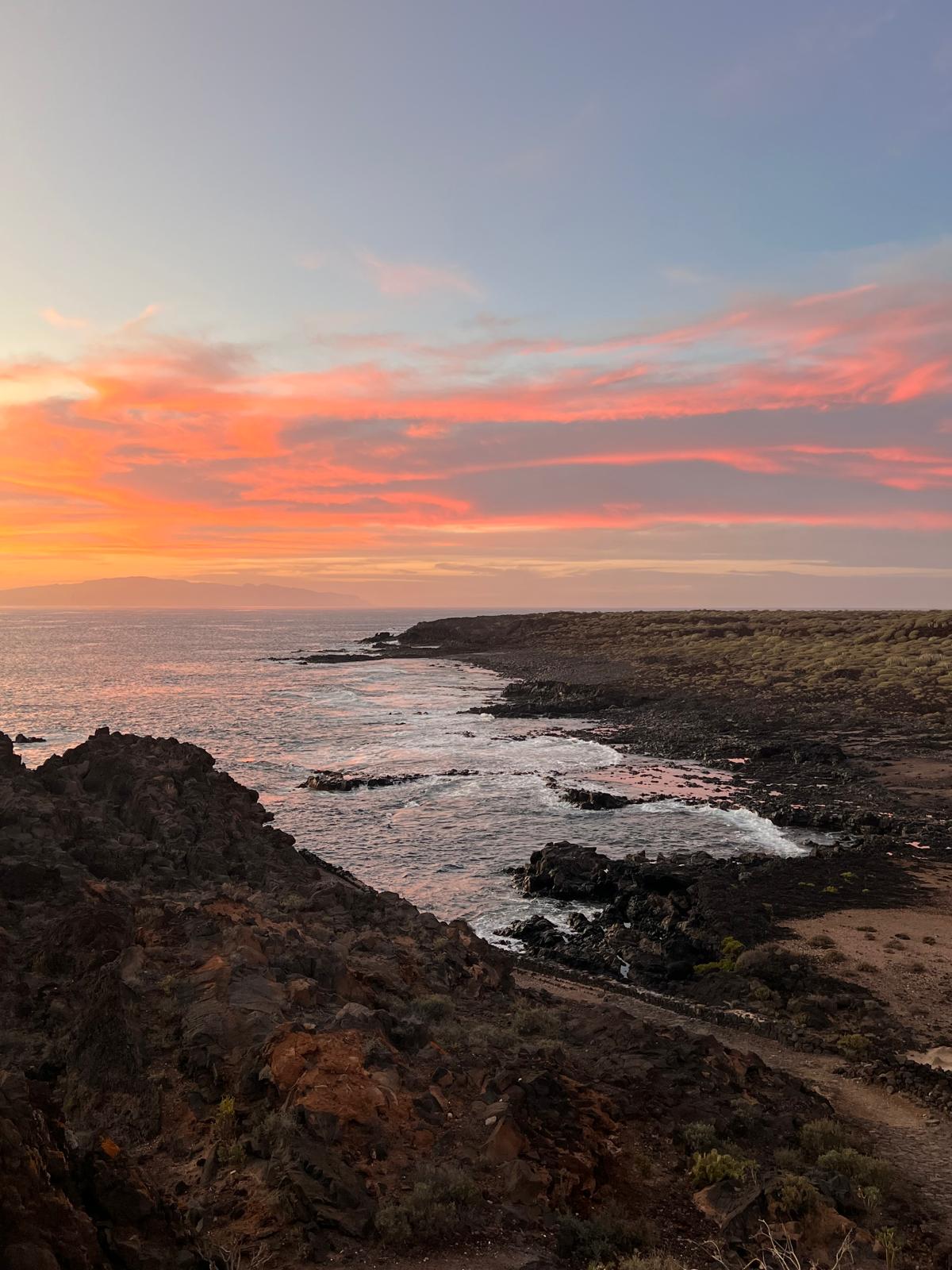
Sunset coastal landscape inspiration
Palette inspiration from the island.
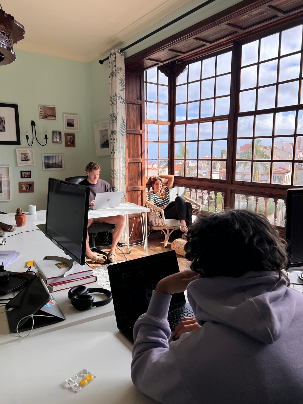
Nine Coliving workspace
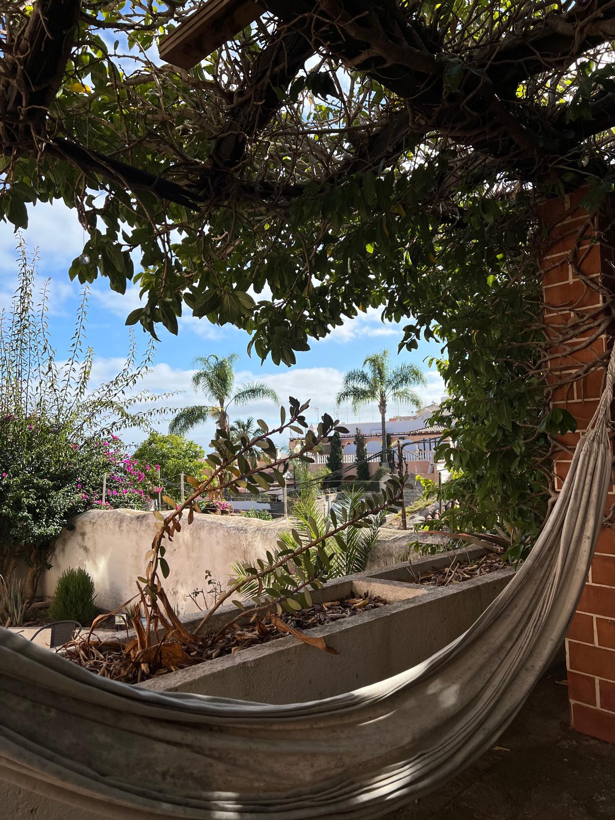
Nine Coliving garden hammock
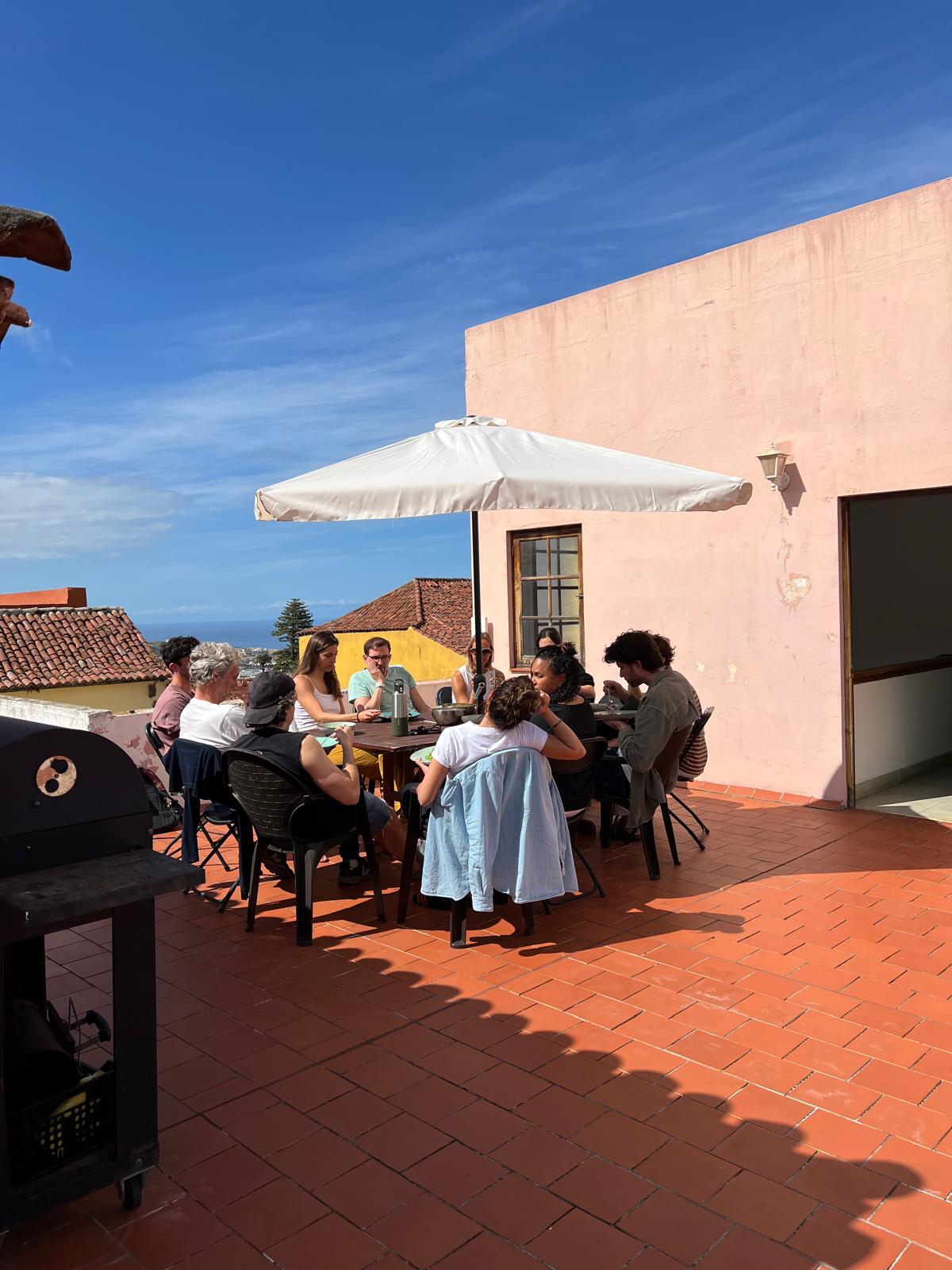
Nine Coliving rooftop terrace
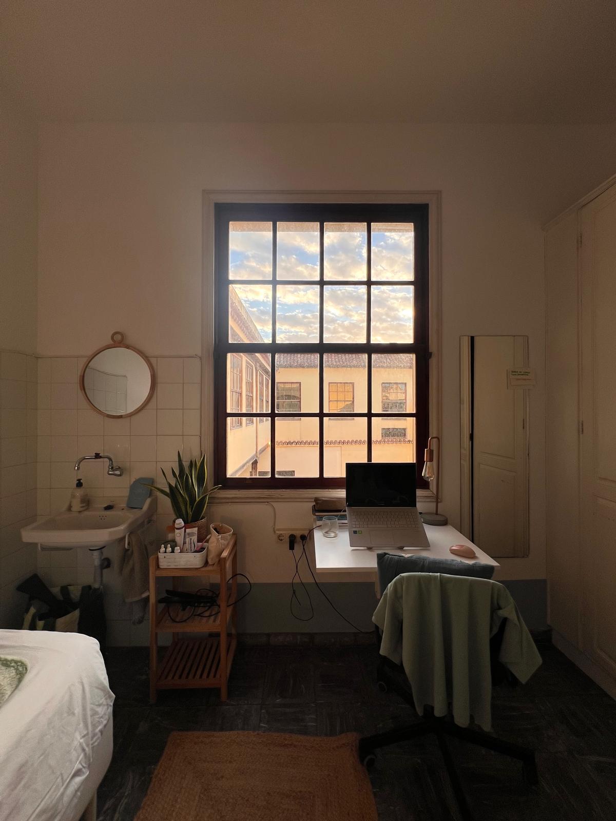
Nine Coliving bedroom
Nine Coliving common area
Nine Coliving sunroom
The house.
Nine Coliving UI kit

UI kit: colour system, typography and base elements.

Components designed for the Nine Coliving website

Components designed for the website.

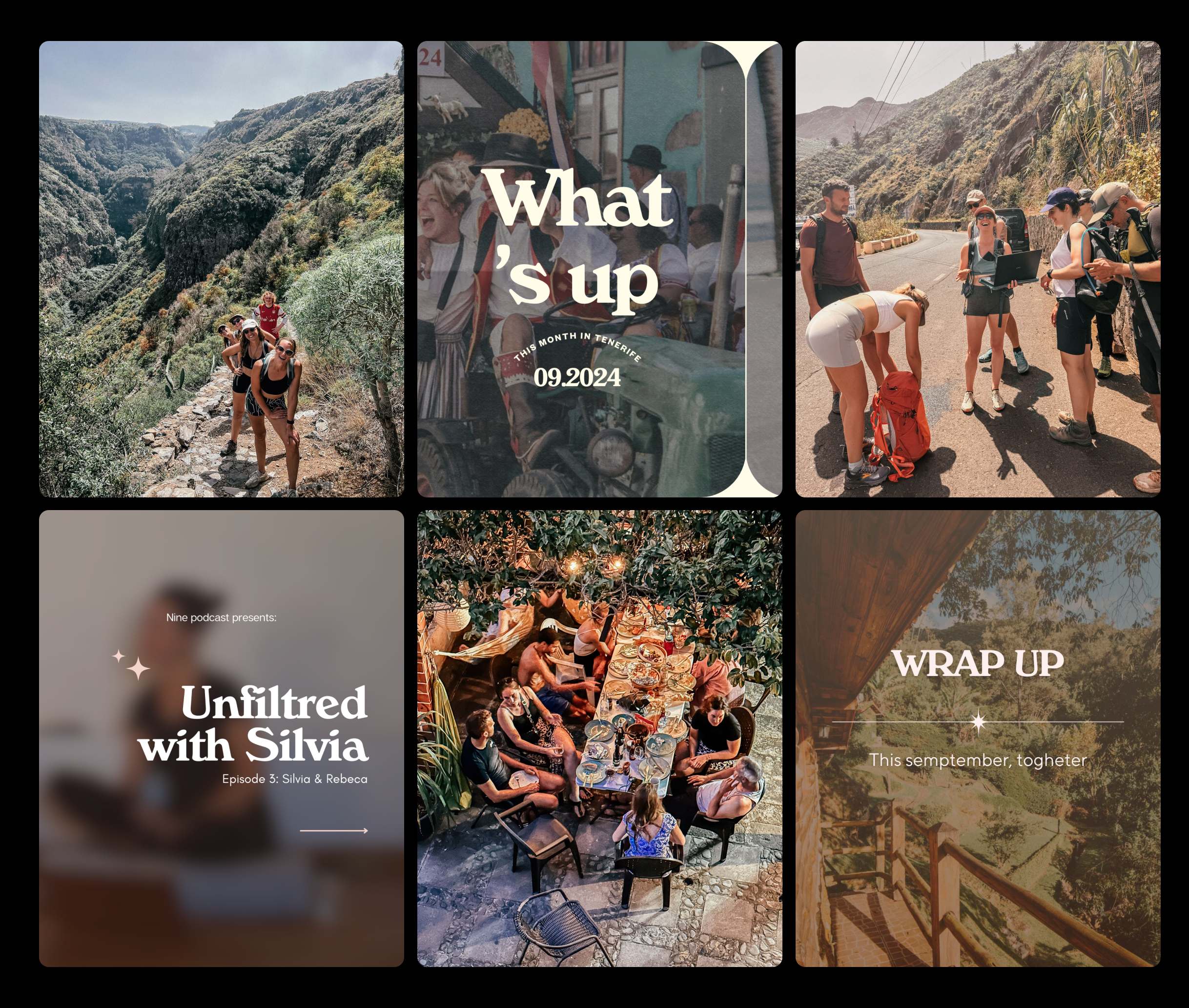
Nine Coliving Instagram templates

The identity beyond the website: Instagram templates for community stories and updates.

03.2

Website

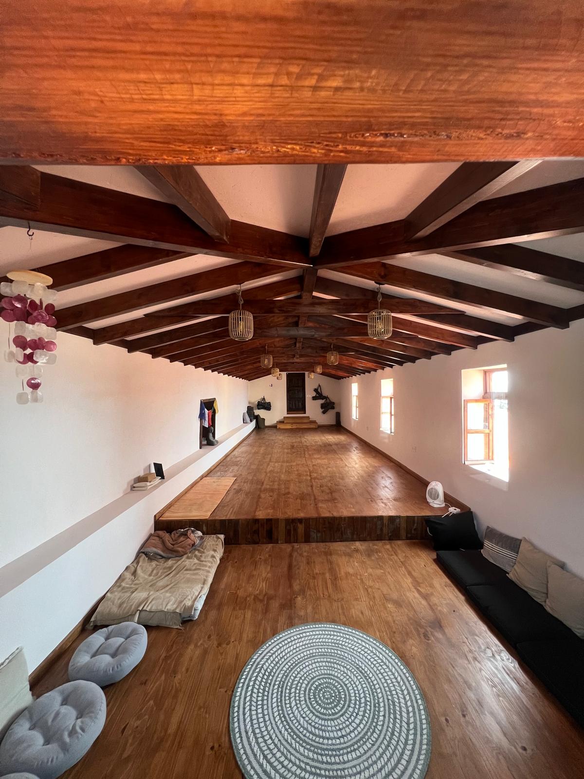
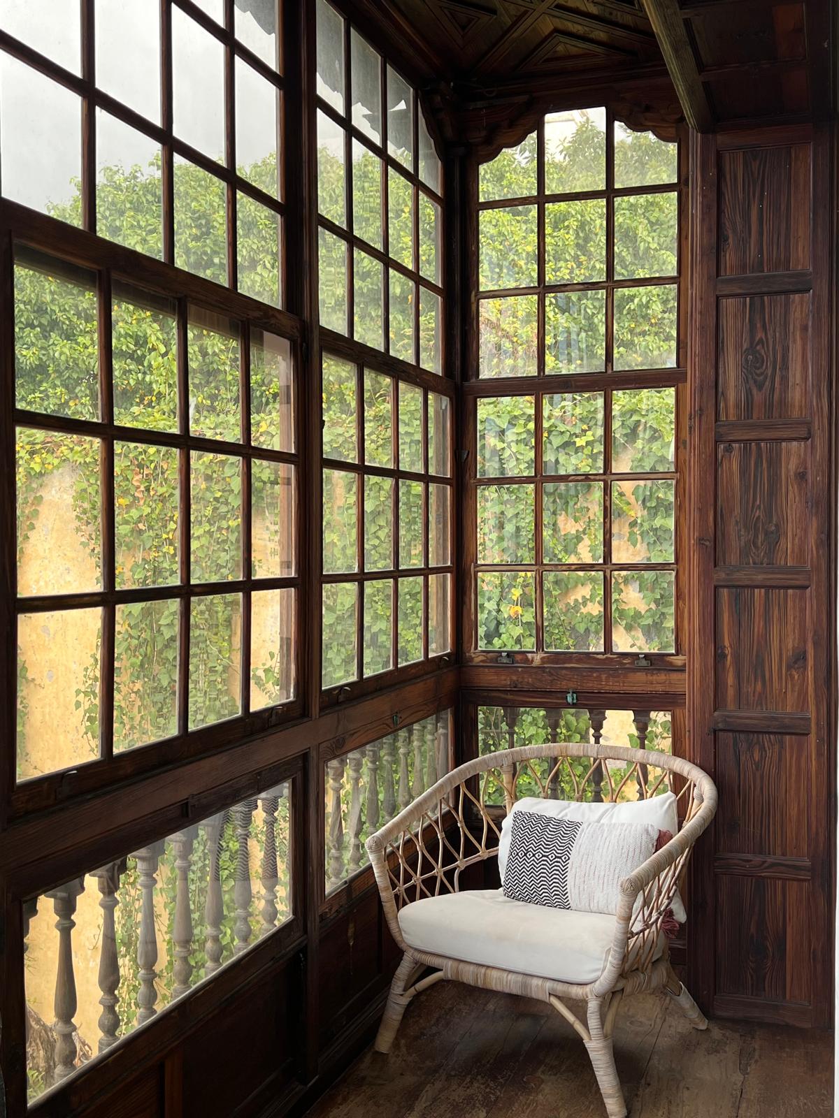
In person, Nine feels soft, airy and calm. The house has wide rooms, tall windows and bright corridors: a Scandinavian style inside a historic Canarian building.

The website needed the same feel, so I used editorial layouts, generous spacing and gradients based on the light in the rooms. The aim was for the website and the house to look and feel consistent.

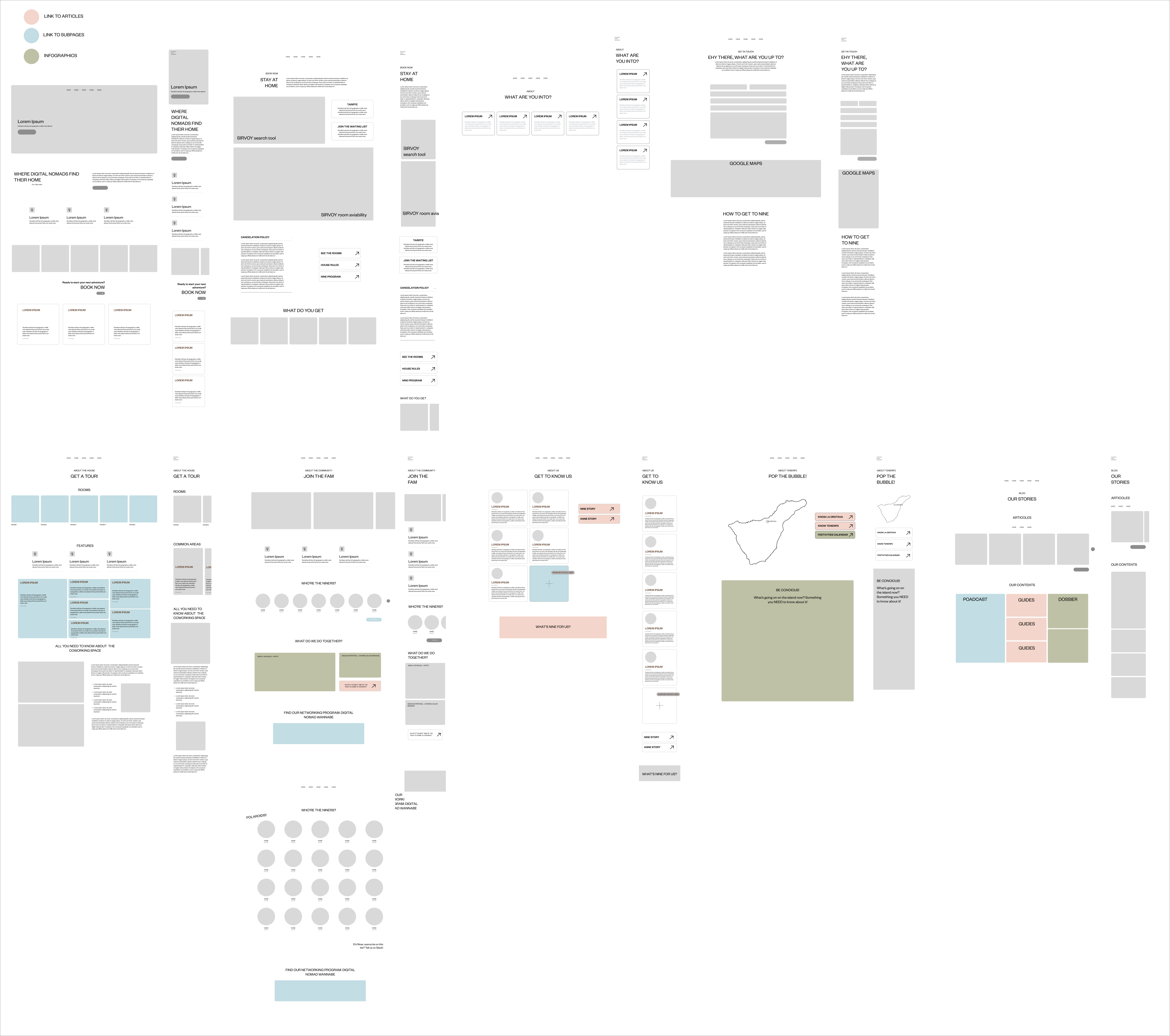
Wireframes of every page, desktop and mobile

Every page mapped in wireframes, desktop and mobile, before any visual design.

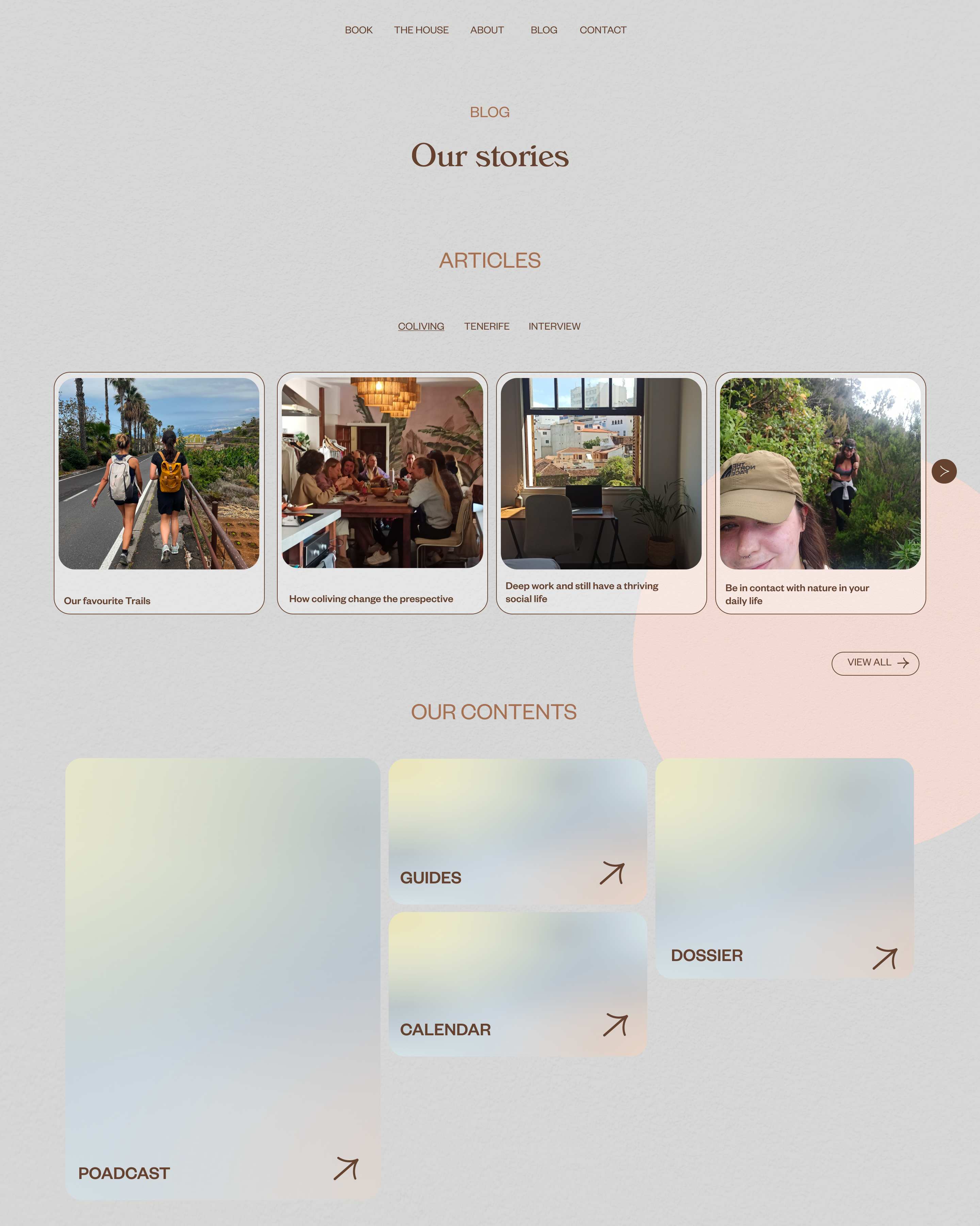
Homepage, mobile
Our stories, desktop
Our stories, mobile

Homepage on mobile, and Our stories on desktop and mobile.

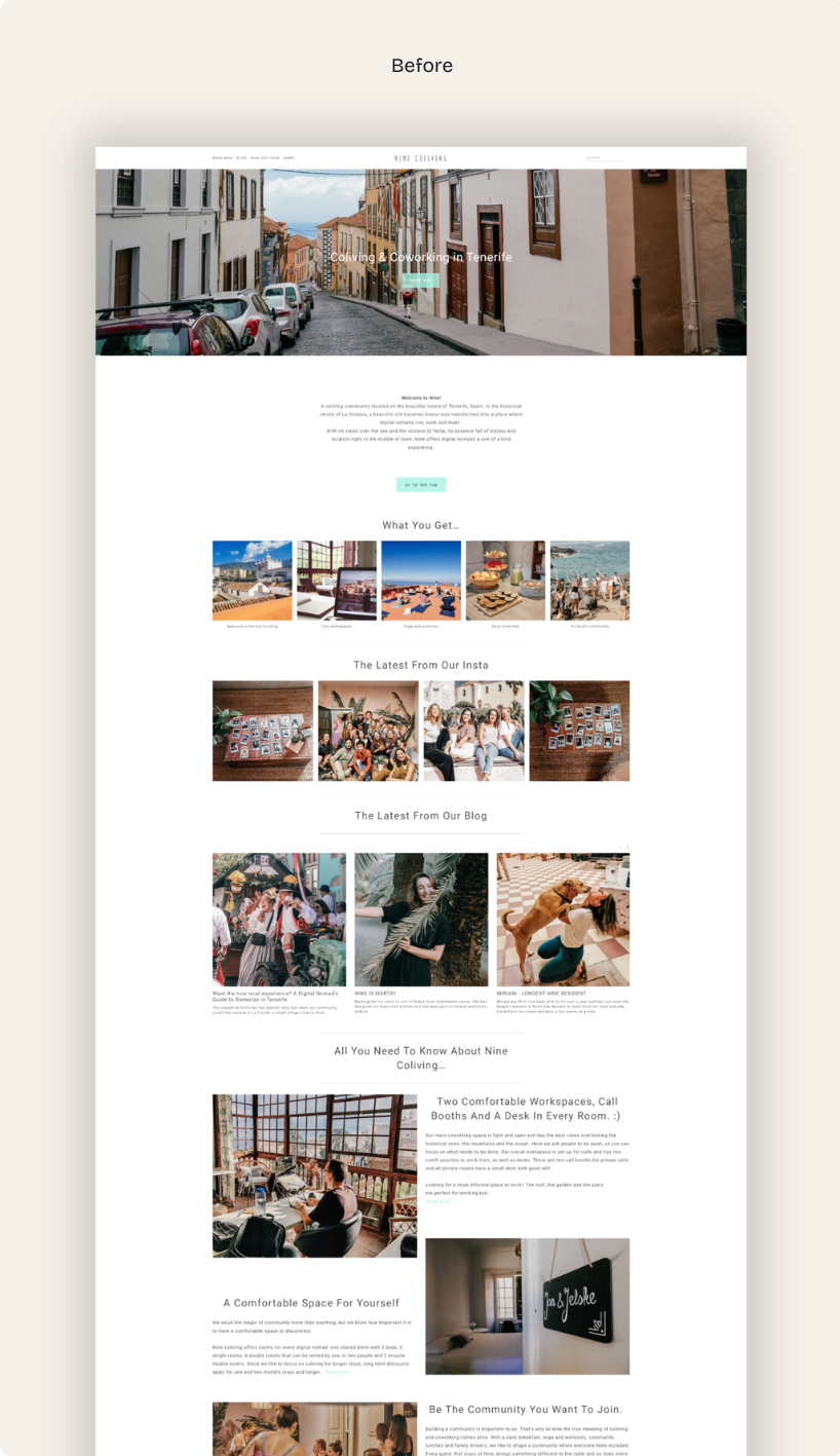
Nine Coliving homepage before redesign
Nine Coliving homepage after redesign
Homepage, before and after.

03.3

Notion ops system

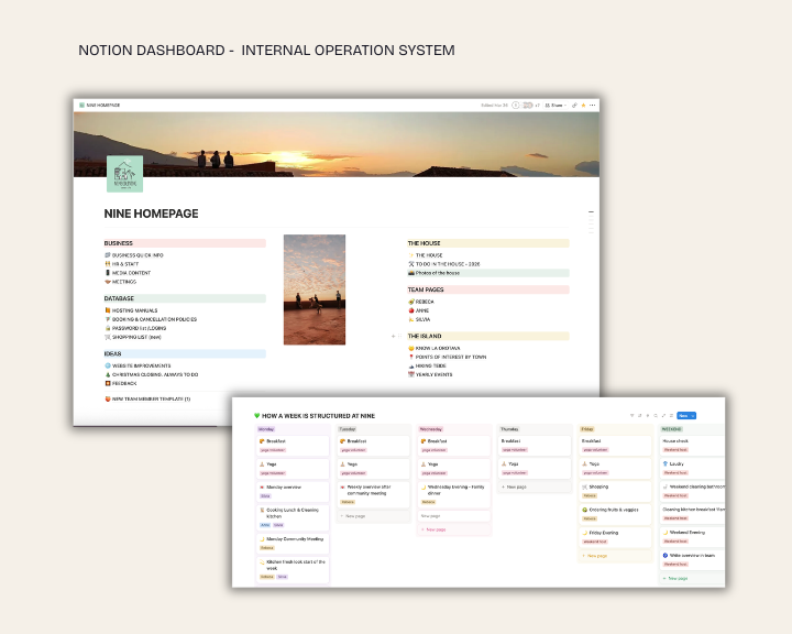
A single dashboard with everything the team needs to stay in sync, accessible from anywhere, including during a check-in. Before, the team had to catch each other in person between shifts. With everyone on different schedules, information often got lost. Notion gave the team one shared place for all information.

Nine Coliving Notion operations dashboard
The Notion dashboard the team works from.

04 / After the handover

What happened next.

The new website went live, and guests say it's now easier to find the information they need. The Notion system is still in daily use: the team relies on it to track long-term projects and develop new ideas and research.

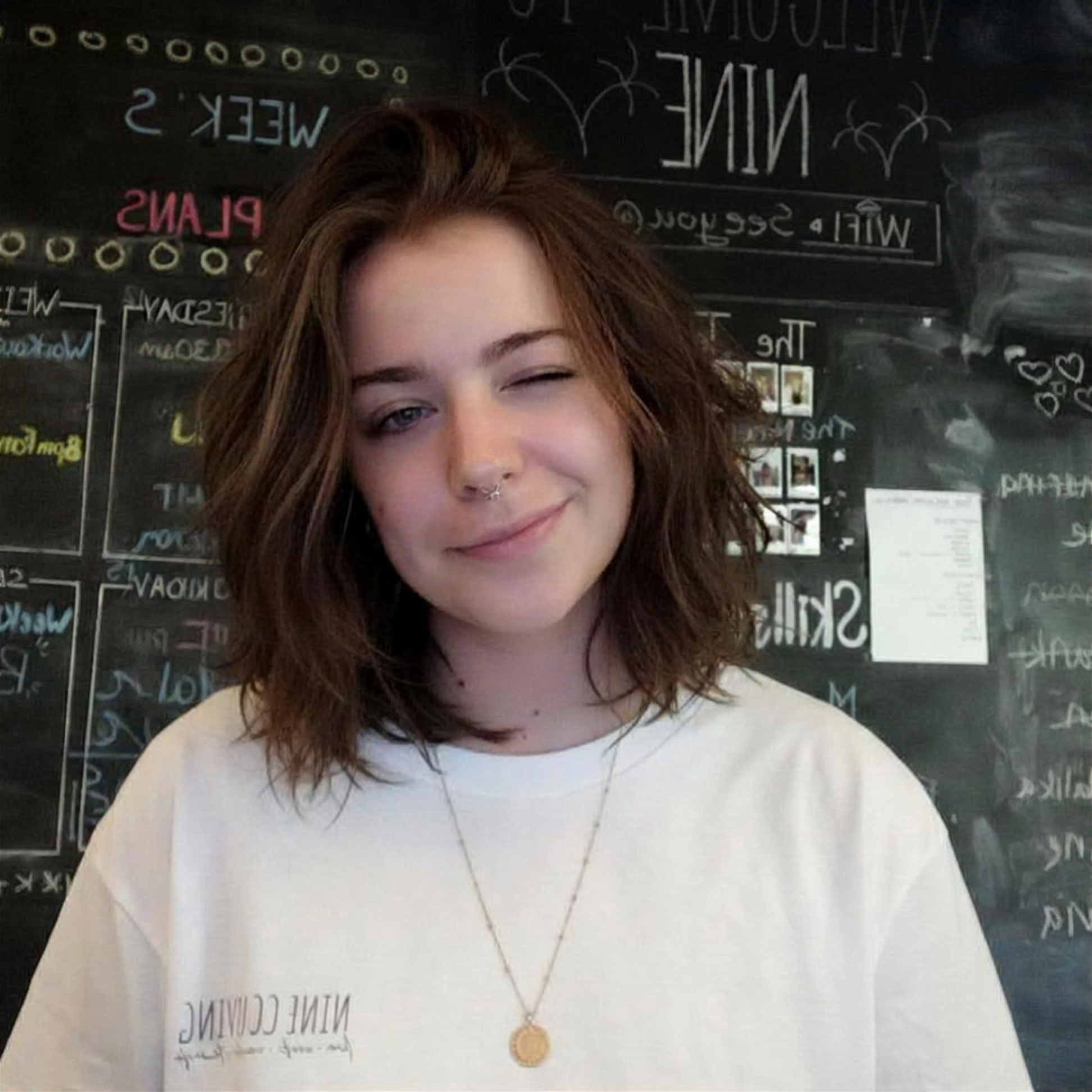
Giada at Nine Coliving

Once a niner, always a niner. Find me in this magical place a few months a year.

← Back to projects

Giada Pacchioni — 2024