01 — Context
Six months embedded in a coliving space in Tenerife, with a dual mandate: host the community, redesign the brand around it.
Nine Coliving · Tenerife · Mar–Aug 2024
Role
Embedded host & designer
Programme
Erasmus+ Young Entrepreneurs
Duration
6 months on site
Team size
5 people
Deliverables
Brand identity, website, Notion ops system
Nine Coliving is a small, community-driven coliving space in the north of Tenerife, hosting remote workers and creatives for stays of a few weeks to several months. I joined through Erasmus+ EYE, a programme structured around mutual skill transfer — design and research from me, hospitality and operations from the team, daily work side by side.
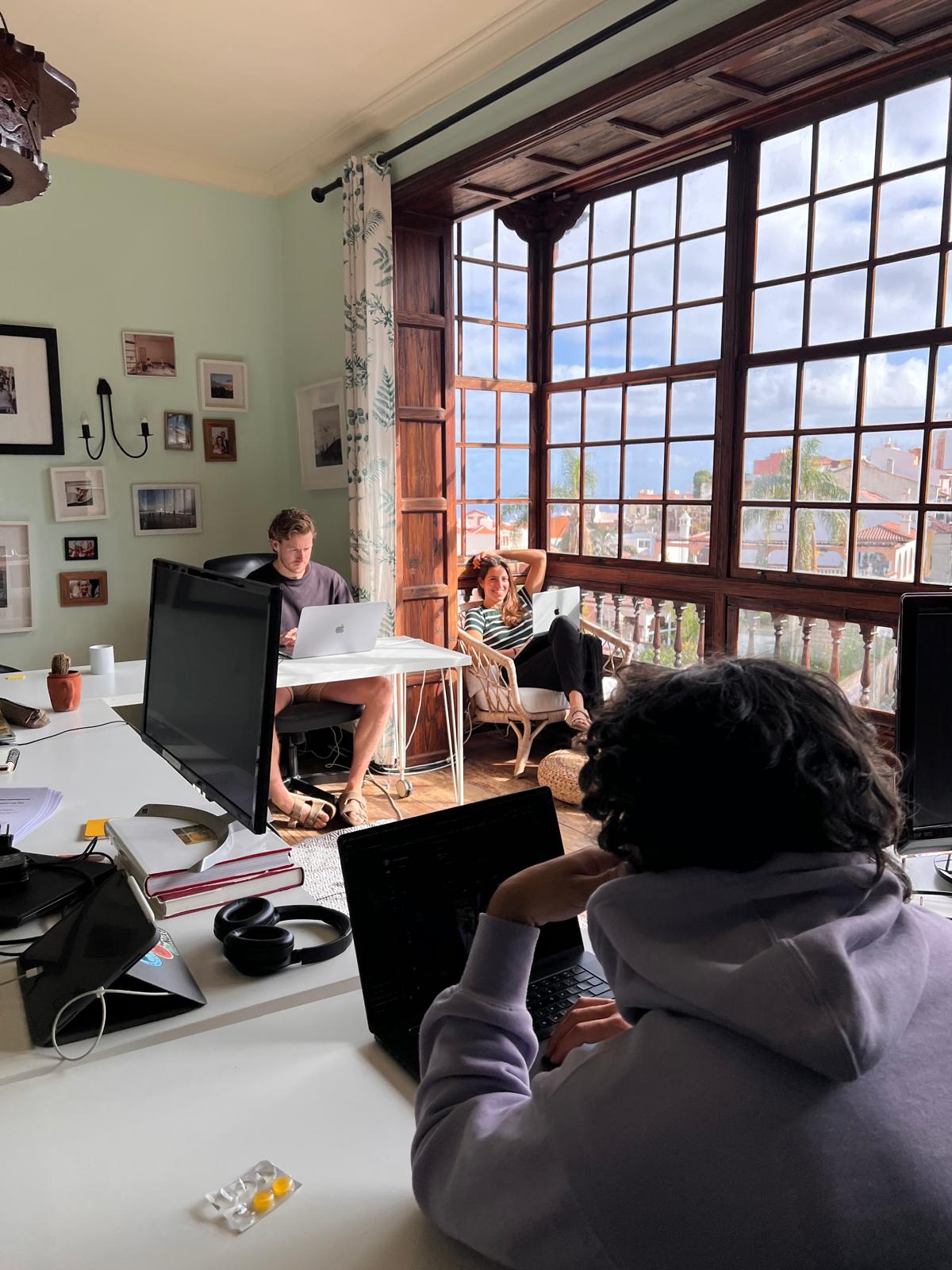
My role was deliberately hybrid. As community host I ran check-ins and check-outs, supported guests through their stay, and held the day-to-day texture of the house. As designer I used that same proximity to run research and rebuild three things the team had outgrown: brand identity, website, internal operations.
01 / Audience mismatch
The visual identity felt dated and skewed the audience: the brand was read as targeted to women, while Nine was built for a mixed community of remote workers and creatives.
02 / Invisible daily life
The rhythm of activities, the kind of people who came through, what a week at Nine actually looked like — none of it was legible from the outside. Prospective guests had to imagine it.
03 / Fragmented operations
Internal workflows were spread across tools that didn't talk to each other, slowing host onboarding and making guest information easy to lose.
Nine wanted to position itself as a pro-local coliving — at a moment when Tenerife was openly questioning the cost of mass tourism.
The brief, in one line
Make Nine legible — to guests, to the team, and to the island it sits in.
02 — Immersion
Six months on the inside.
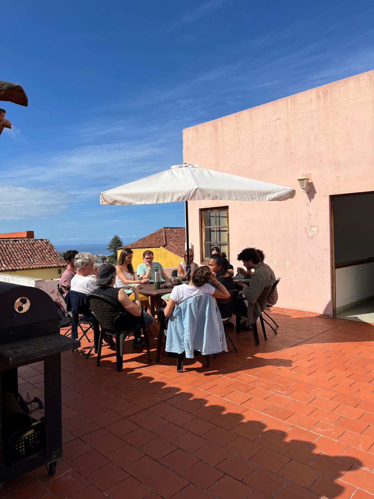
Living and working at Nine for six months meant the research never really started or stopped. Check-ins doubled as first interviews, shared dinners surfaced patterns a survey would have missed, and the team's daily rhythms became the baseline I designed against. Tenerife, in those months, was openly questioning the cost of mass tourism — and Nine sat inside that conversation.
Project Timeline
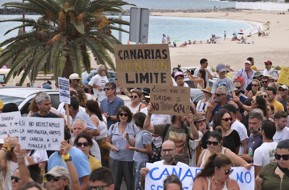
Manifestation, Tenerife — 2024
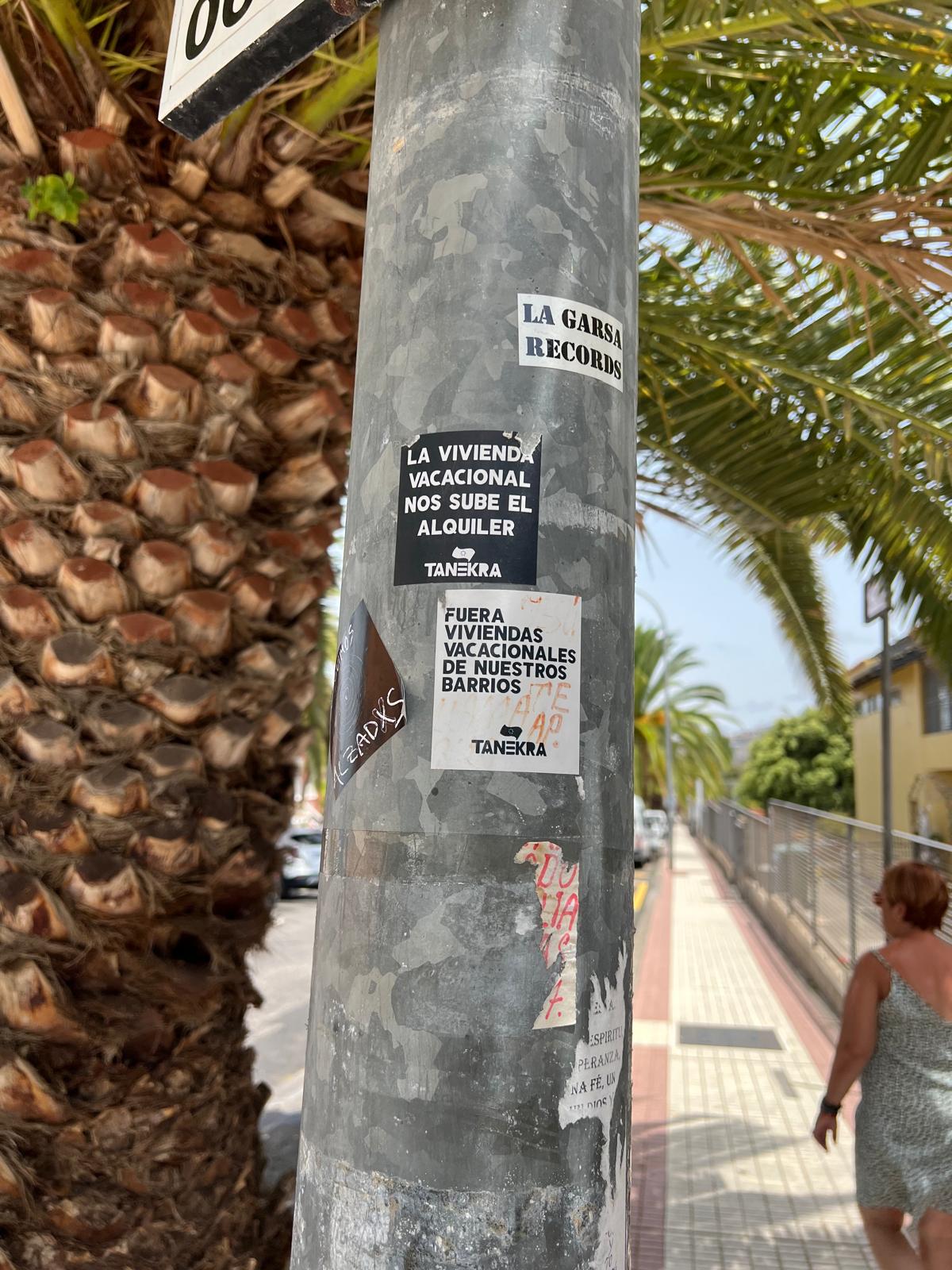
La Orotava, street level
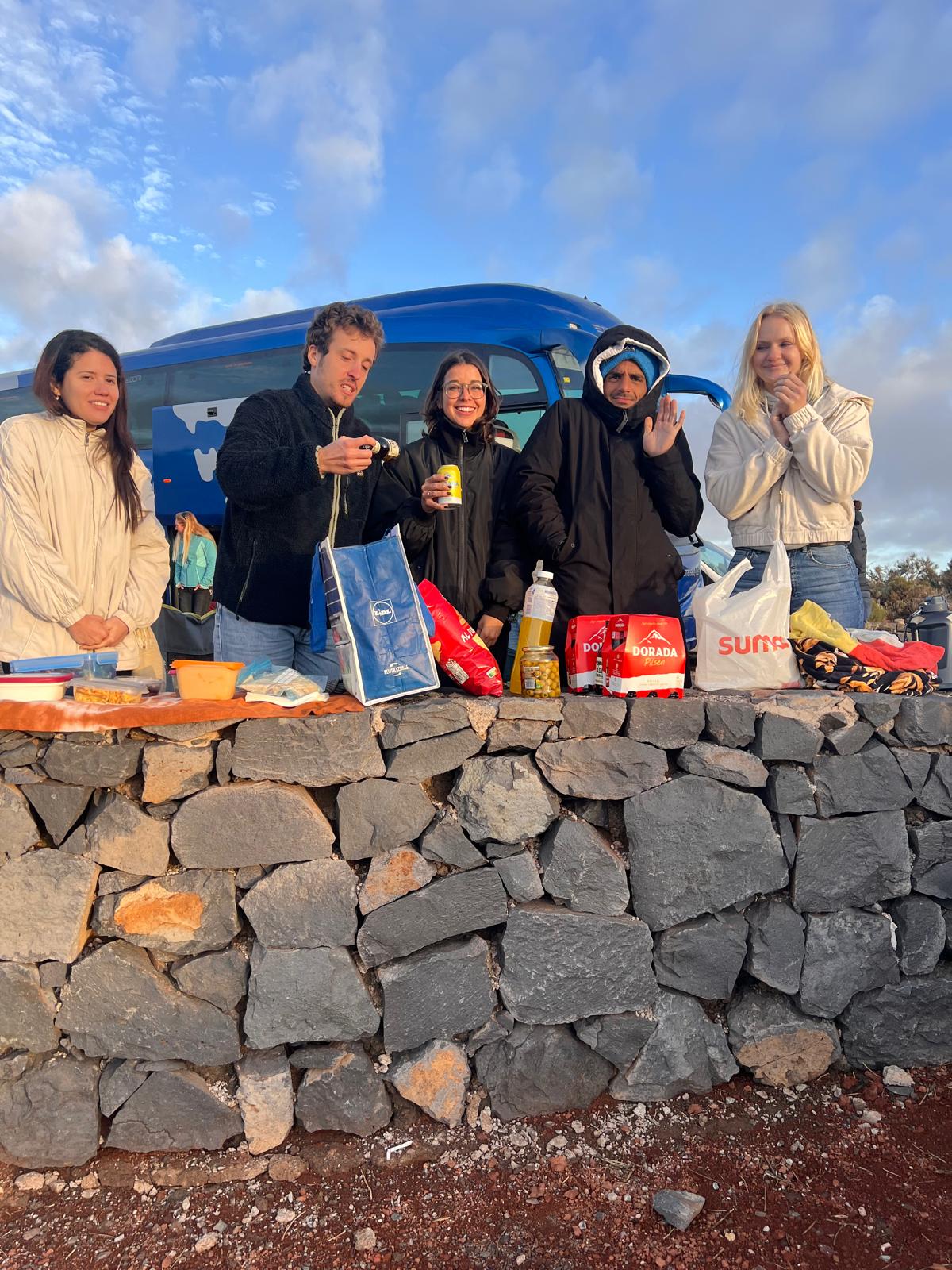
Community trip
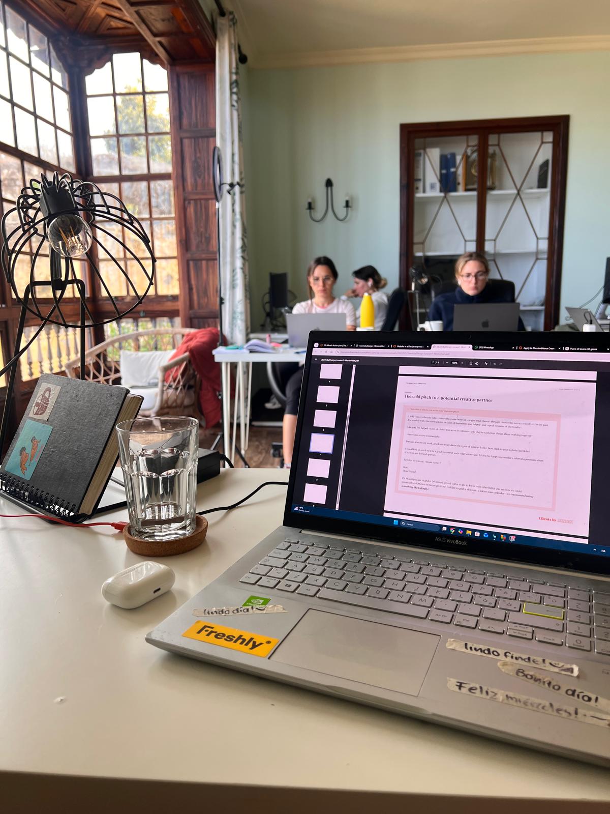
Designing on site
03 — Research
What six months of proximity made visible.
Embedded research produced 32 checkout interviews, a community-wide survey with over 100 responses, a card sorting session, and four focus groups with guests and team members. Four findings shaped every design decision that followed.
Checkout interviews
Survey responses
Card sorting session
Focus groups
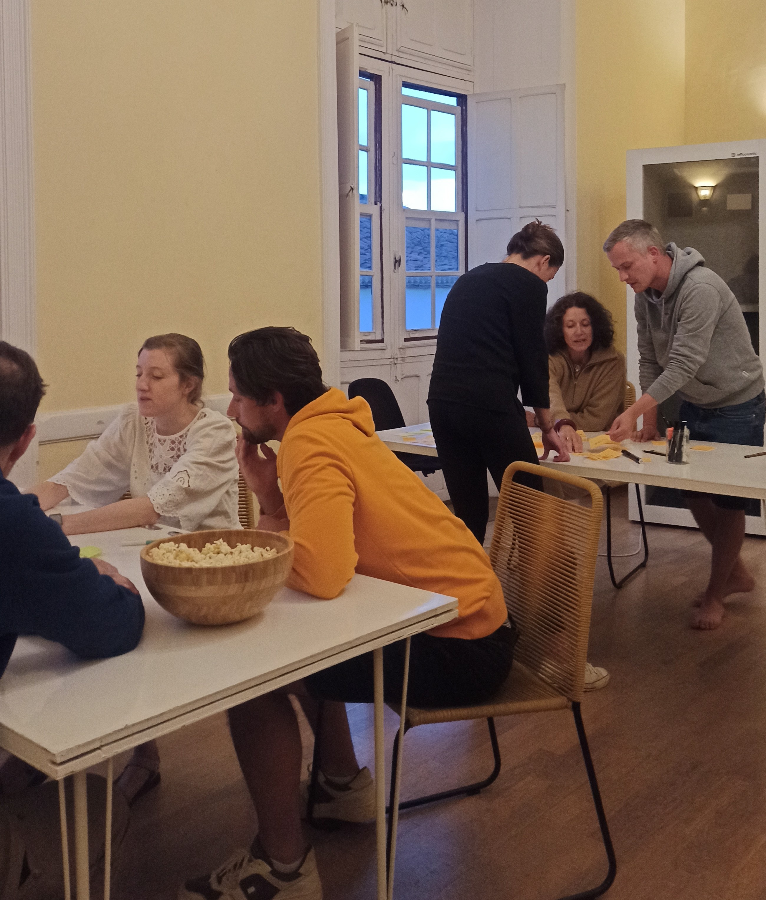
Card sorting session
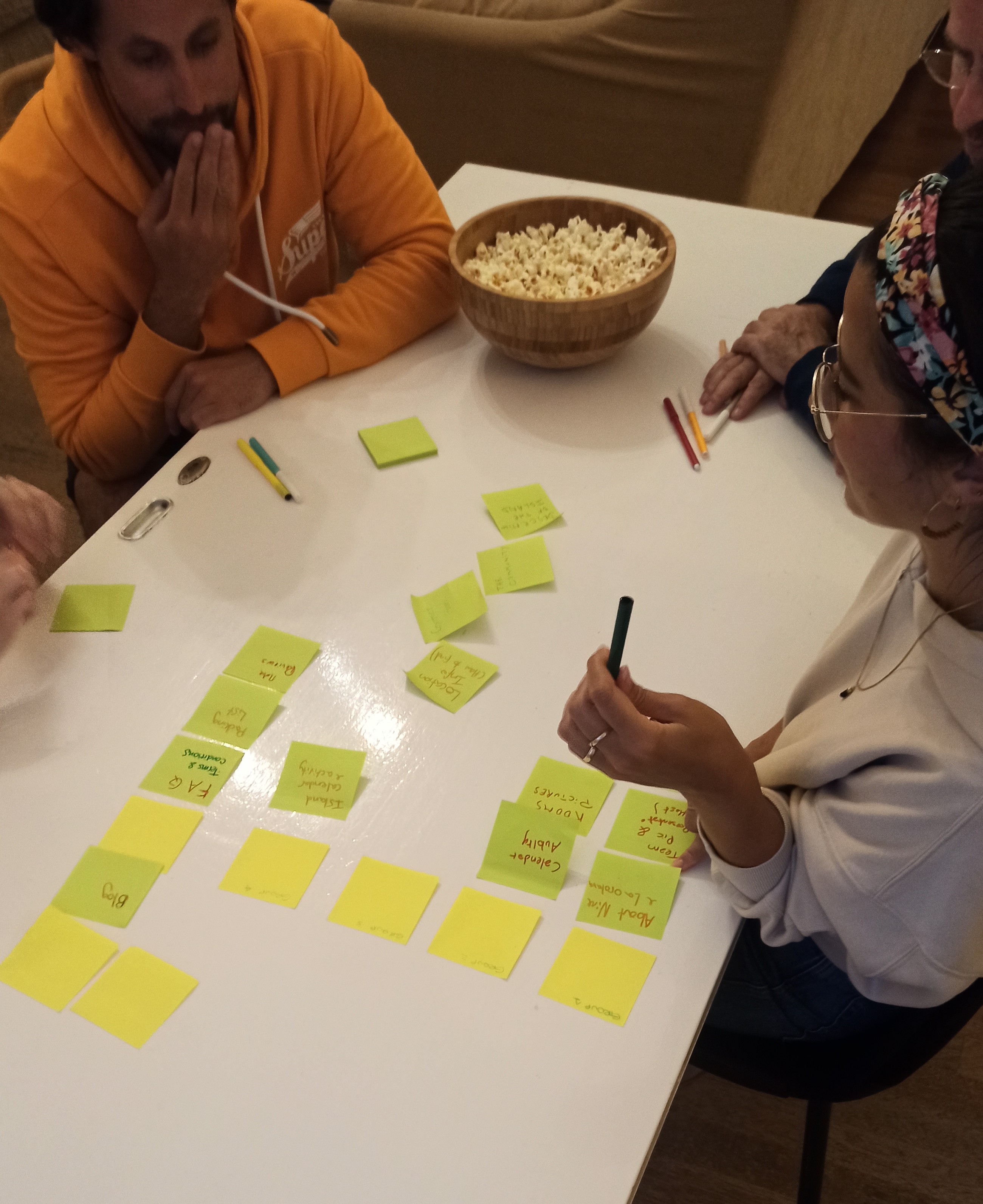
Focus group on guest experience
Insight 01 / 04
The brand was selecting an audience the team hadn't chosen.
70% of bookings came from women aged 28–35, but checkout interviews showed the target audience was mixed: remote workers, creatives, and freelancers across genders and life stages. The visual language was filtering the audience before the team had a chance to.
→ Design decision
Rebuild the brand identity around a tone that reads as inclusive without feeling neutralised — new colour system, typography, and editorial voice.
04 — Design
A redesign, not a reinvention.
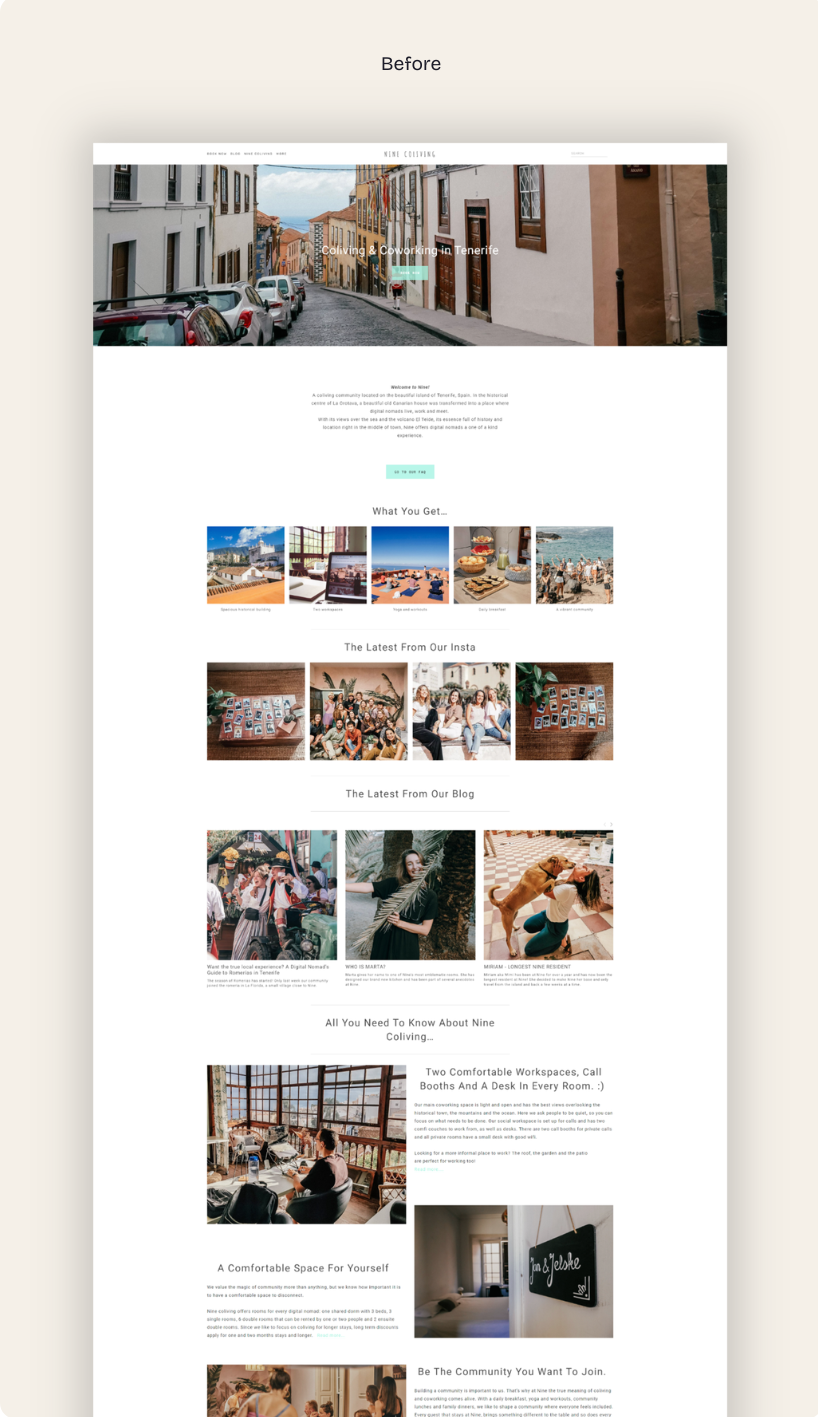
Nine already existed: a Squarespace site, a tiffany-blue logo, an audience that had grown over years. The work wasn't to start over — it was to take what was there and build a visual system around it, one that matched the experience of actually being in the house.
04.1 / Brand Identity
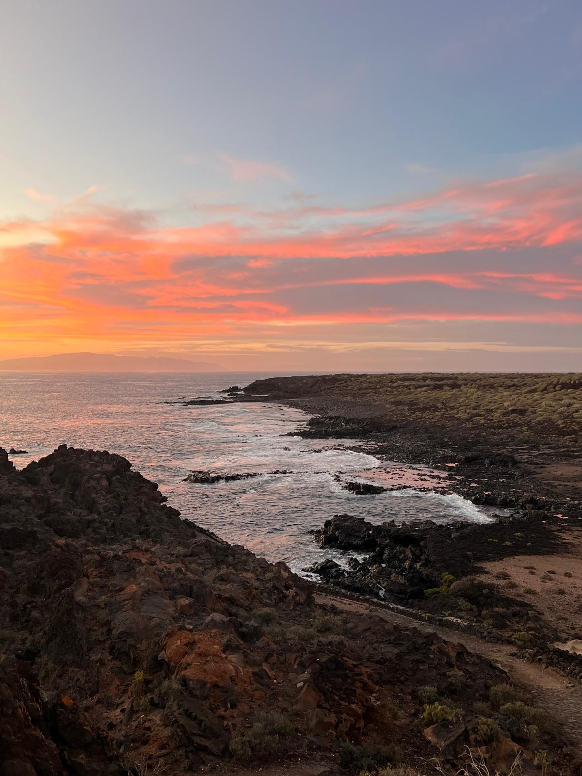
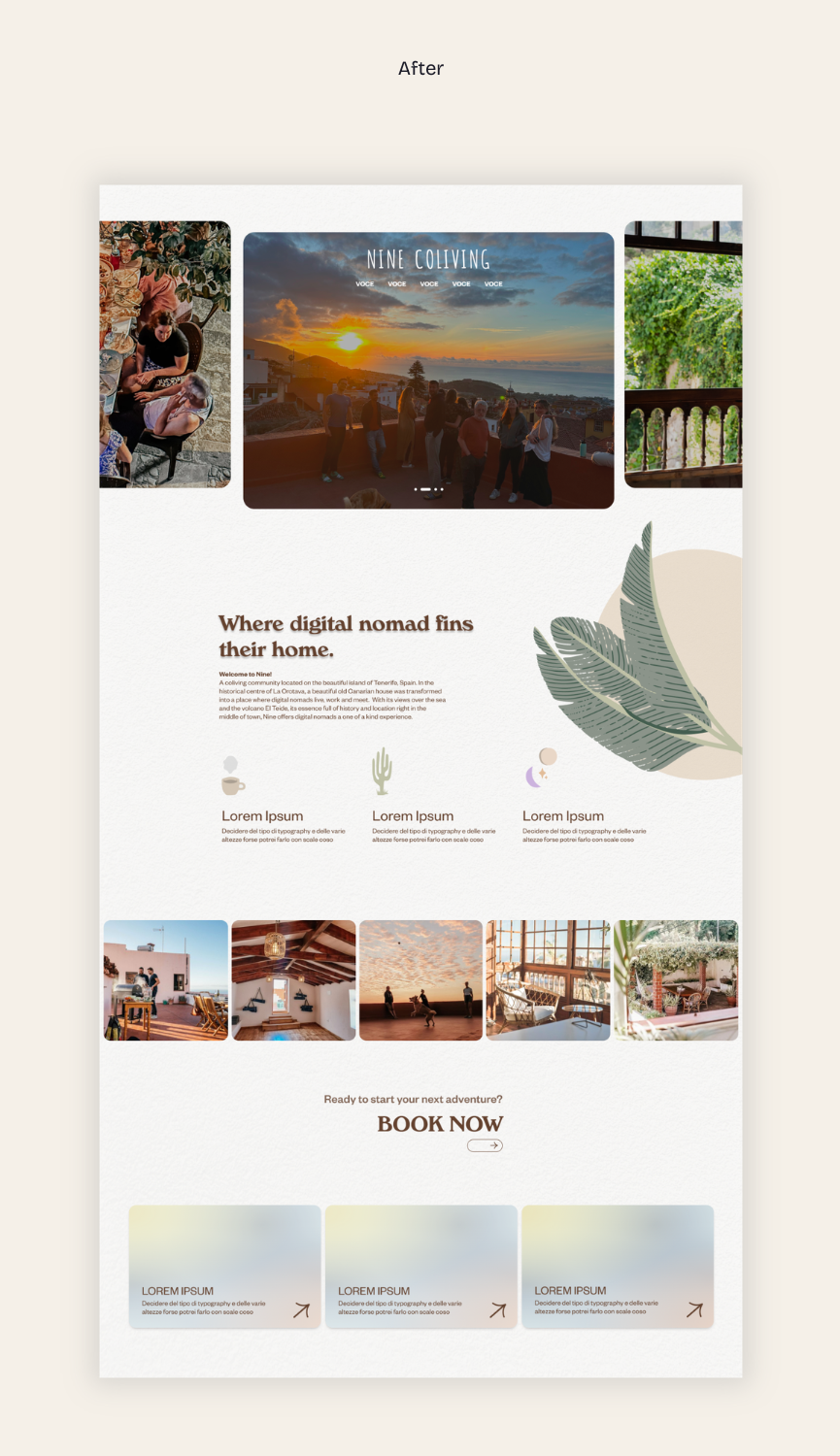
The palette wasn't there. The tiffany blue from the logo was — that stayed, as a thread of continuity. Around it, I built a system that recalled the real atmospheres guests live through at Nine:
- — Rust red and deep green, for the volcanic rock and northern forests of Tenerife
- — Shades of pink and dark brown, drawn from the colours of the historic house itself
- — The original tiffany blue, kept as a narrative anchor
04.2 / Website
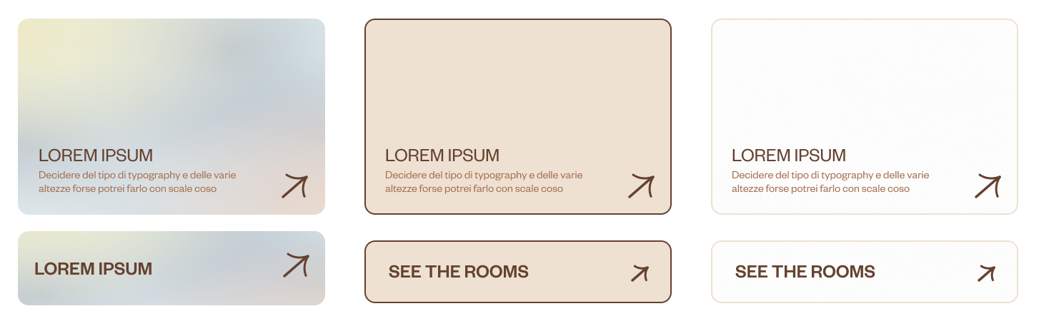
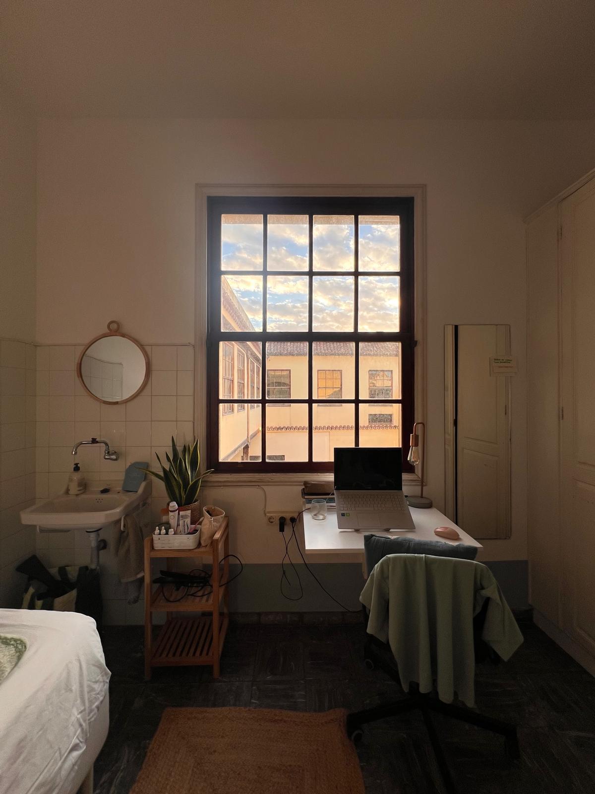
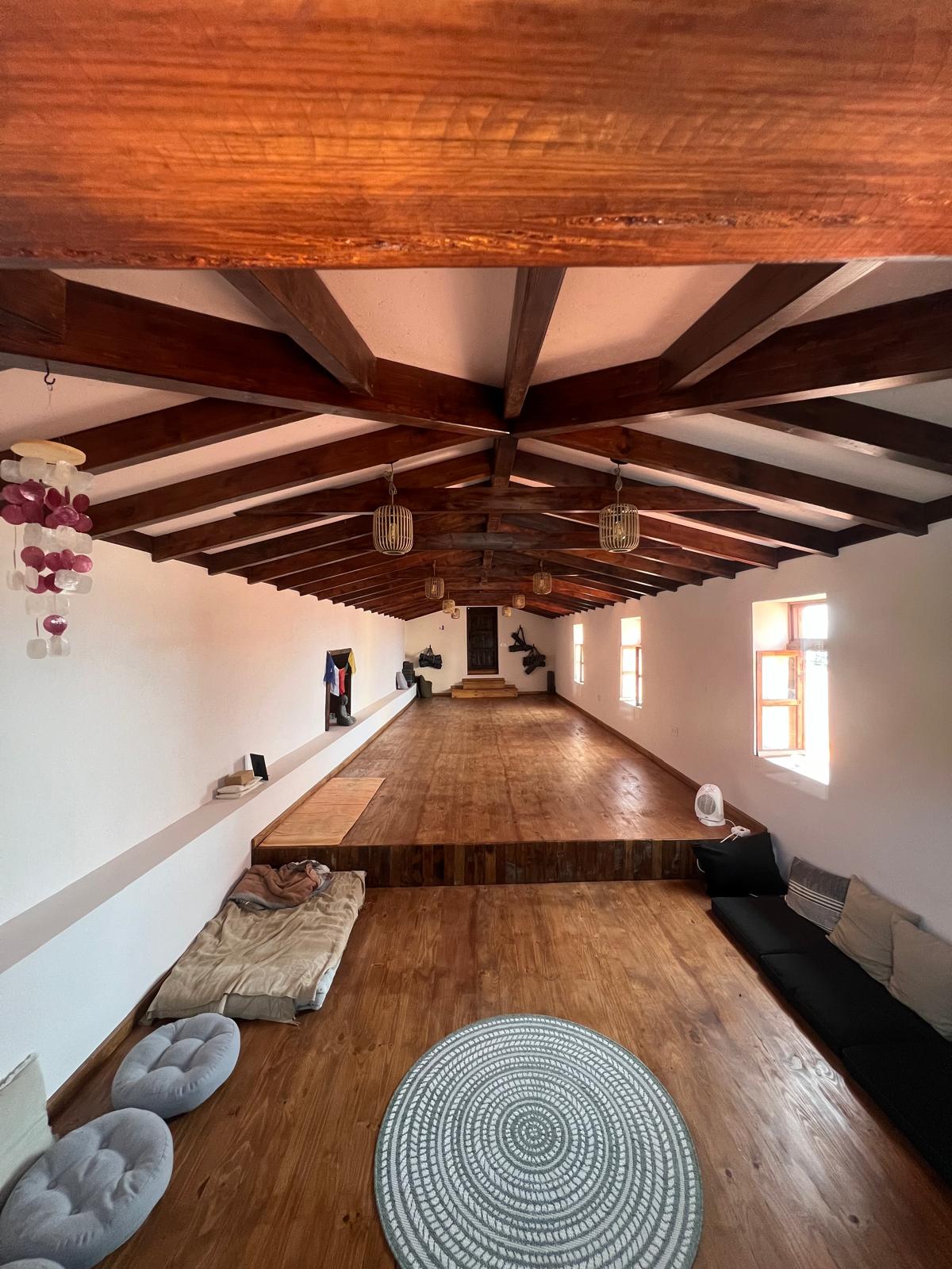
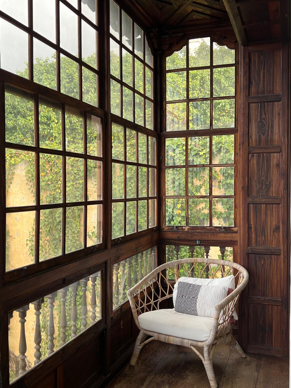
Nine's atmosphere in person is soft, airy, slow. The house is built around wide rooms, tall windows, and corridors filled with light — a Scandinavian sensibility set inside a historic Canarian building.
The website needed to feel the same: editorial layouts, generous spacing, gradients that echo how light moves through the rooms. The goal was simple — the visual identity online should remind you of the place, and the place should remind you of the identity.
04.3 / Notion Ops System
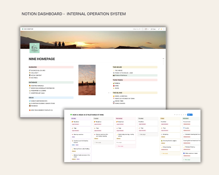
A single dashboard for everything the team needs to stay in sync — accessible from a desk, from a hike, from the supermarket, from a check-in. Before, syncing meant catching each other live across shifts; with everyone on different schedules, that often meant information simply got lost. Notion replaced the scramble with a shared source of truth.

Once a niner, always a niner — find me in this magical place a few months a year.